
Our Brand
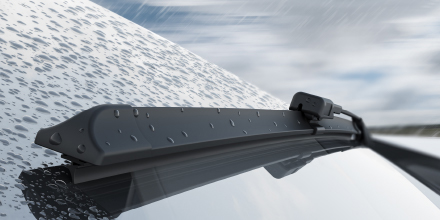
Clear Vision, Safe Driving
We continue on our journey by developing our sector and renewing ourselves for the future. Our new brand identity is powered by our family which has raised three generations of engineers in 50 years and by the innovative approach of the automobile industry where we produce parts.
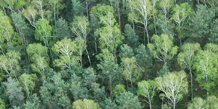
Silbak values are present in every product we produce and at every step of the 50-year journey. As we walk towards the future, we move forward with the same values. With our products, we care about the lived experience, so we start everything by thinking of people. We are aware that the 'development-oriented perspective' is a never-ending journey in the automobile world, of which we are a part, and we enjoy this journey. While producing parts suitable for thousands of vehicles, we work with engineer precision and increase our quality with every kilometer. For a sustainable life and a better world, we use all the possibilities of our age and constantly update our production processes. We aim to control pollution risks and reduce our environmental footprint by thinking about future generations. We know that life is not the destination, but the journey itself, and we are constantly advancing with this philosophy.
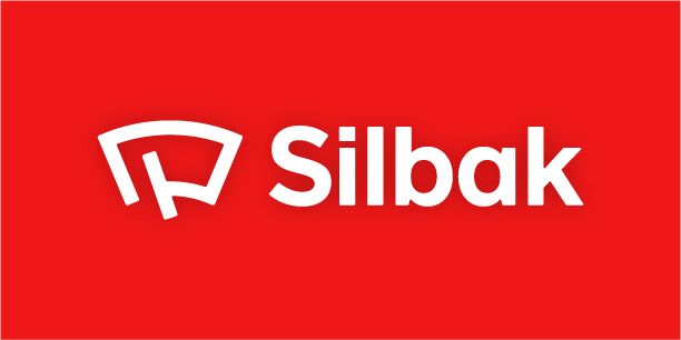
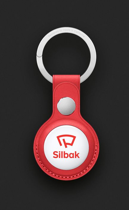
Our Logo
While designing our new logo, Mehmet Gözetlik designed a new Silbak lettering, all letters of which are unique to us. Our new emblem reflects our 50 years of experience in wiper production.

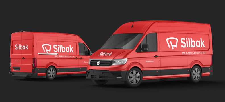
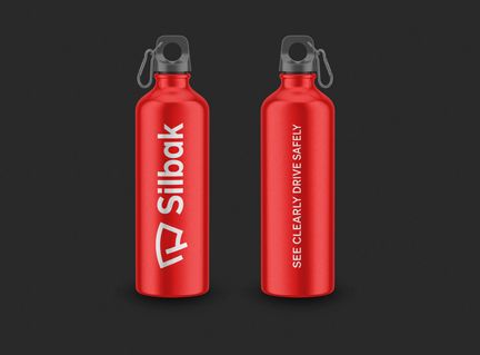
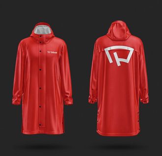
Our Colours
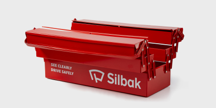
The Red in our logo represents Turkey, our innovative and bold brand culture. We use Silbak red with matte black, anthracite, metallic gray and complementary colors.
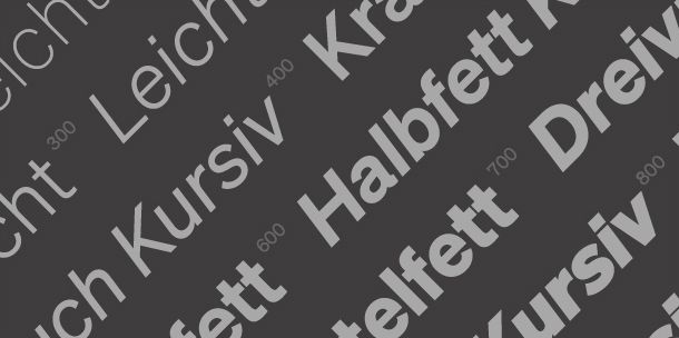
Our Typography
The Söhne font family, which is the foundation of our brand identity, typographically complements the unique Silbak logo and enables us to offer a holistic brand communication experience to all our customers.
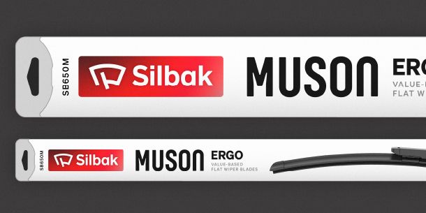
Our Packaging
In our new packaging, we focus on using less plastic and replacing fossil fuel-based plastics with renewable or recycled alternatives, within the framework of our sustainability principles.
Discover more about Silbak values.
Our Quality Assurance
For 50 years, we have been providing clear vision and safe driving to millions of vehicles on all roads.
Our Quality Assurance
For 50 years, we have been providing clear vision and safe driving to millions of vehicles on all roads.

50. Years
For 50 years, we have been providing millions of vehicles with clearer vision and safer driving.